Wednesday, February 18, 2015

Wassily Kandinsky, Squares with Concentric Circes

This project could be done with any grade level. For younger children it helps to have the paper already divided into sections or squares. I used a yellow colored pencil to draw the lines that separated each square. Folding the paper into sections could also work, but I found it actually would have taken longer to do that, and the paper didn't lay as flat as I would have liked.

We used the tempera blocks from the art cupboard. I've never used this type of tempera (also known as tempera cakes) so wanted to try it. Just add a little water  (similar to watercolors).

Another option is to have each student make one concentric circle, then arrange them in rows like Kandinsky's work.

Here's an example of the project I presented to the class: 


Thursday, February 12, 2015

Self-Portraits with Paul Klee color blocks


Two fifth grade classes looked at few of Paul Klee's paintings done with block colors and a self-portrait. We talked about the paintings a bit and how Klee used color to express himself, his emotions and ideas. We also examined this project as illustrated on the following two web sites:

Two links where I found this project:
--http://thetalkingwallsmurals.blogspot.com/2013/01/paul-klee-inspired-self-portrait-lesson.html
--http://www.teachkidsart.net/self-portrait-workshop-paul-klee/

Five links to sample Paul Klee works:
--http://en.wikipedia.org/wiki/Paul_Klee#mediaviewer/File:Paul_Klee_1911.jpg
--http://en.wikipedia.org/wiki/Paul_Klee#mediaviewer/File:Red_Balloon.JPG
--http://arteascuola.com/wp-content/uploads/2012/04/08-00571.jpg
--http://en.wikipedia.org/wiki/Paul_Klee#mediaviewer/File:Paul_Klee,_In_den_Häusern_von_St._Germain.jpg
--http://en.wikipedia.org/wiki/Paul_Klee#mediaviewer/File:Senecio2.JPG

Self-portrait lesson:
I drew a large face divided into halves and fourths, talked about how each eye is 1/5 of the width of your face, the nose is 1/5 wide, sides of mouth end below pupils, ears are same length as between eyes and bottom of nose, etc.
Similar, but more realistic, to this link:
http://kiokreations.com/wp-content/uploads/2011/02/How-to-draw-face.jpg

How to:
Then I showed them how to draw a face with the correct proportions and let them use their small whiteboards and erasable markers to practice face shape, features and proportions, while I drew on the large whiteboard.  Then we moved to watercolor paper and pencils and mirrors, to sketch themselves with simple lines.  Students traced their pencil lines with a black Sharpie, then choose 12 pre-cut tissue paper squares to place in a grid on their drawing.  The teachers and I misted the artwork with water from spray bottles.  Students used paintbrushes to smooth the paper down and spread the water evenly.  They could remove the tissue paper within a couple minutes, or leave the tissue paper to dry, at which point it falls off or is easily loosened.  Done!  I purchased Spectra tissue paper that is supposed to allow the colors to "bleed" in a watercolor effect, and cut the squares with a sliding paper cutter.

Materials:  watercolor paper, pencils, mirrors, Sharpies, tissue paper that "bleeds."
Time:  1+ hour, but could be adjusted depending on time available.  Could do less instruction time on Paul Klee and/or on how to draw a face. 

Friday, January 23, 2015

Texture Rubbings


In the completed project above, the green quadrilateral and lower right red triangle are window screen, above the red triangle is a purple shoe print, the bottom central black section is fabric lace, the central pink triangle is a texture plate and the left central purple triangle is a leaf. 
I created this design to encourage students to try many different textures and colors, but plain white paper works too. Darker crayon colors seemed to show up better than lighter colors, such as yellow or pale pink. 

Project length: 45 minutes
Audience: 1st Grade
Materials:
  -white copy paper (not card stock or construction)
  -peeled crayons (large supply in the art cupboard)
  -textures, such as a leaf, fabric lace, mesh/screen. There are also wonderful texture plates in the art cupboard (plastic sheets with ridges in many designs). Be creative or experimental... The bottom of your shoe might make a good rubbing pattern. 

Wednesday, January 21, 2015

Hubble Space Telescope Chalk Pastels

Hello again from Mr. Reardon’s class! This month, we learned about the Hubble Space Telescope and interpretted its images using chalk pastels. It was awesome.


We started out by talking about the Hubble Space Telescope. The telescope does not merely see the visible spectrum far beyond what humans can see, but it can also see the near ultraviolet and near infrared spectra. So the colors and formations captured by the telescope are infinitely diverse and colorful. I brought some print outs of the photos taken by the Hubble Space Telescope. We talked about the vastness of space, the shapes of galaxies, that nebulas are made of gas (giggle), and that those tiny white spots in the photos are stars, just like our sun. The images are so amazing, and they were to be our inspiration for making art!


Well, the perfect medium for interpretting these incredible photos would be chalk pastels. Chalk pastels can be transparent or opaque. Depending on how we use the pastels, the color they may be hard and intense, or they can be soft and subtle. And, we get to use the pastels on black paper, which is the perfect canvas to emulate deep space.

I showed a few techniques for using the pastels. Like, drawing a dotted line to lightly sketch the composition. Or using the torn edge of a paper as a mask to create a hard edge. I also demonstrated that when we smudge the color, it softens its appearance. When we leave the color pure and untouched, it is more opaque and sharp. I encouraged them to not cover the entire sheet of paper with color; the black paper will help us represent the vastness of space.

Finally, we discussed that chalk pastels are messy, and that's why we covered their desks with paper. Mr. Reardon asked them to please roll up their sleeves.

Then we got to it...


It was a deep space free for all. I encouraged them to experiment with opacity and blending colors. Try to remember that there is energy and gravity in these space formations, so there should be spots of intesity in their compositions.

Many students completed more than one drawing. It was a good time.

I sprayed the pictures with clear coat fixative to help prevent smearing. I'm actually not sure if that was a good idea, because now they stink! Hopefully, they'll air out soon and we'll be able to hang them in the hall this week.

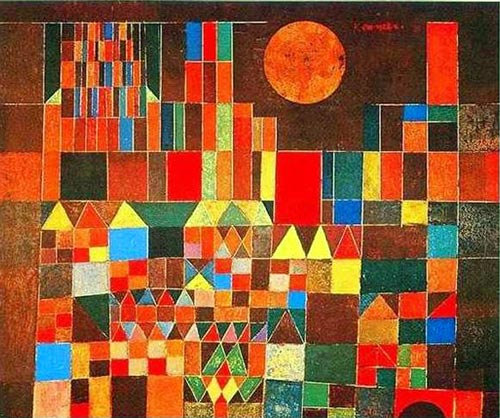
You can really see the inspiration in their interpretations.


Tuesday, January 20, 2015

Feathered Birds (example of mixed media)

Step 3
Project length: 50-60 minutes
Audience: 1st Grade
Materials:
  -white school glue
  -feathers
  -googly eyes
  -pencil, colored pencils or markers
  -colored construction paper for body 
    & beak
  -white card stock or construction paper for the background

These 3 examples were displayed to visually demonstrate the steps involved in the project.
Step 2
The two body parts were pre-cut for the students. They glued the body and beak down onto a piece of paper. Next a googly eye was added.
Step 1
We then passed out feathers of all colors and shapes, and sizes that weren't too small or too big for this project. Some students used all of one color, or used several different colors. (The teacher provided the students with a helpful limitation/recommendation of 8 feathers each, which helped the students narrow down their choices and stay within our time frame.)
The students then used a pencil or markers to add some background or other details.

Wednesday, November 26, 2014

Pop Art Grumpy Cats

I had the pleasure of leading Mr. Reardon's 4th grade class in a lesson about pop art. First, I explained how pop art is a movement that surfaced in 1950's, and challenges traditional art by using imagery from popular culture, such as subject matter used in advertising and the news. Also, pop art usually has a visual "pop" by using bright, vibrant colors with simplified, iconic forms and plenty of contrast. I had print outs of examples of pop art for each table of students to reference.

For our subject matter, we used Grumpy Cat. How fun is that? Many of the students weren't familiar with Grumpy cat, so I was lucky enough to show them examples of Grumpy Cat memes. The students were very excited!  

To begin, I asked them to put their names on the back of their watercolor paper. Then, I lead them through a step-by-step process on how to draw Grumpy Cat that I found here. I drew Grumpy Cat on the white board, and the students drew him using pencil.

Then the students traced their cats using a thick, black Sharpie, and colored the pupils of the eyes black. I provided the students with a limited color palette of tempera paints. Each table of students got to work with 4 different bright colors, and I encouraged them to consider the white of the paper a color, too. I instructed them to choose their colors wisely, and not to let any of their colors touch each other, so the shapes that made up their Grumpy Cats wouldn't blend together. When they were finished, we let the paintings dry on the drying rack.


Because the paint covered up the Sharpie lines, I asked Mr. Reardon to let them retrace their Sharpie lines when they were dry. This gave the finishing contrast that was necessary to pop!

We hung the finished pieces in the hallway by the Staff Lounge. They look great! Like Andy Warhol's Marilyns, only much grumpier!  Hope you have a chance to see our Grumpy Cats while they're on dislplay this month. 


Sunday, November 9, 2014

Escher-Like Drawings


Drawing like M. C. Escher is difficult. For this lesson we provided each student with a copy of Step #1 which includes starting points. 

Using a ruler and pencil, they moved on to Step #2 by adding the lines shown in red. 
Step #1
Step #2

Similarly, in Step #3 they added lines shown in red. They were encouraged to consider how to make the image look 3-D using shading to create depth.


Step #4
Step #3


This drawing illustrate the Escher-style of impossible construction (the above figure cannot have both square and round pillars).


The example below is an Escher-like hexagon.

Step #1
Step #2


Step #3


Drawings by Loren M. Milliman